The main goal of our continuous collaboration with Gelbe Seiten was the constant optimization of the digital product to meet the specific requirements and wishes of the users. Our approach focused on making the product more user-friendly and increasing the efficiency of its functions.
Tim Söther served as a sparring partner for the Product Owner and continuously developed new designs together with his team that were specifically targeted at improving user experience. Through these regular adjustments, we were able to continuously increase user satisfaction and improve market penetration in the target group.
Client
Gelbe Seiten Marketing Gesellschaft mbH
Areas
Consulting, Web Design
Year
2022 – 2024
Process
For a period of more than a year, we worked closely with the Product Owner and the internal development team of Gelbe Seiten. Our focus was on two main aspects: conducting user tests and implementing targeted improvements based on the insights gained.
1. User Tests
To better understand the specific needs of users, we conducted regular user tests. These tests provided valuable insights into user behavior, their challenges in operation, and their expectations of the product. Both qualitative and quantitative methods were used to gain as comprehensive a picture as possible of the user experience.
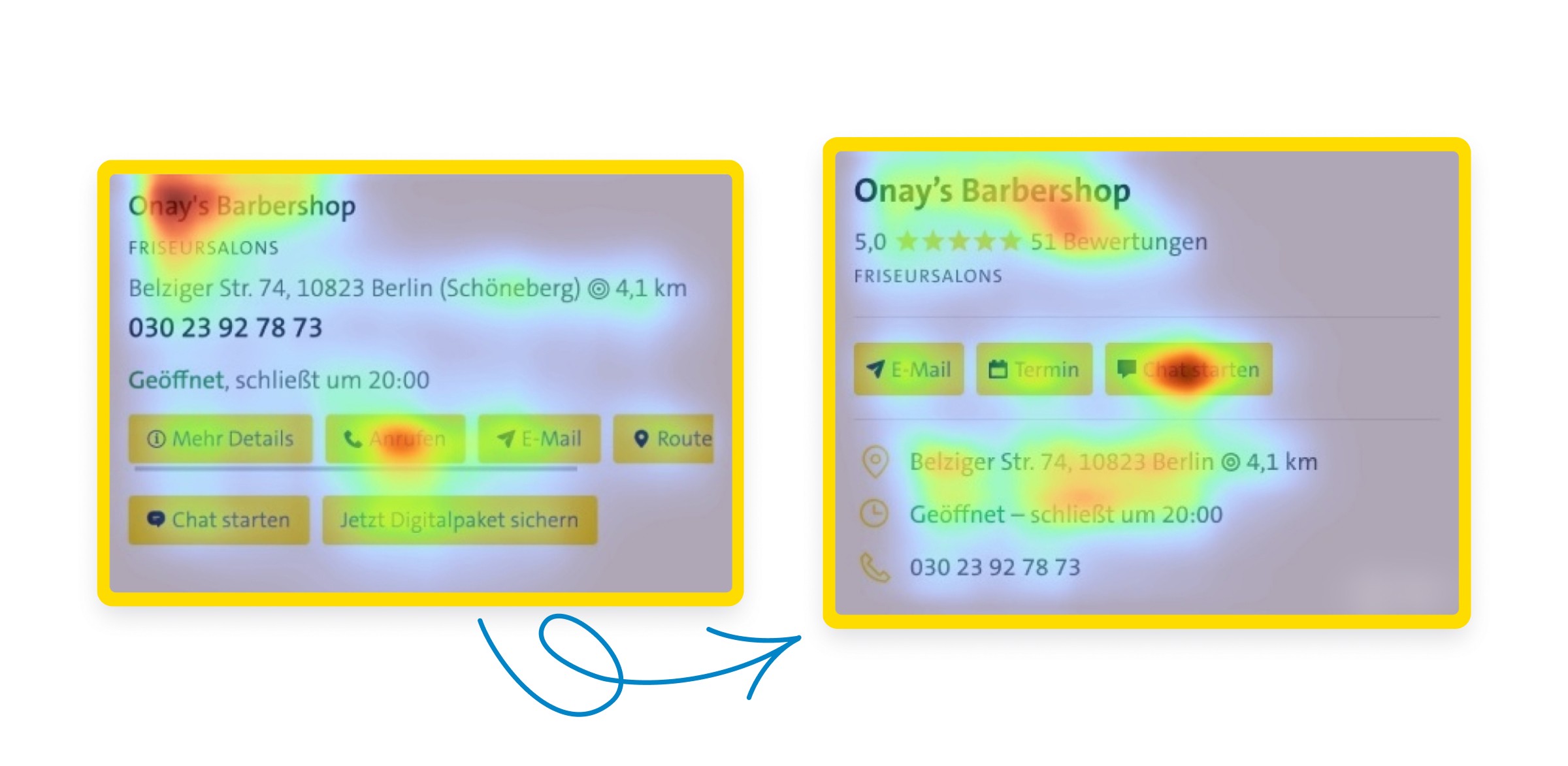
The heatmap analysis illustrates user interactions and shows which areas of the page receive the most attention. The optimized design enhances the accessibility of key functions and information, such as “Start Chat” as well as address and opening hours.
2. Targeted Improvements
Based on the results of the user tests, we identified specific optimization potentials. A central element was streamlining the functions of the product. It turned out that certain features confused users rather than providing added value. By reducing to the essential features and creating an intuitive user guidance, we were able to significantly enhance usability.
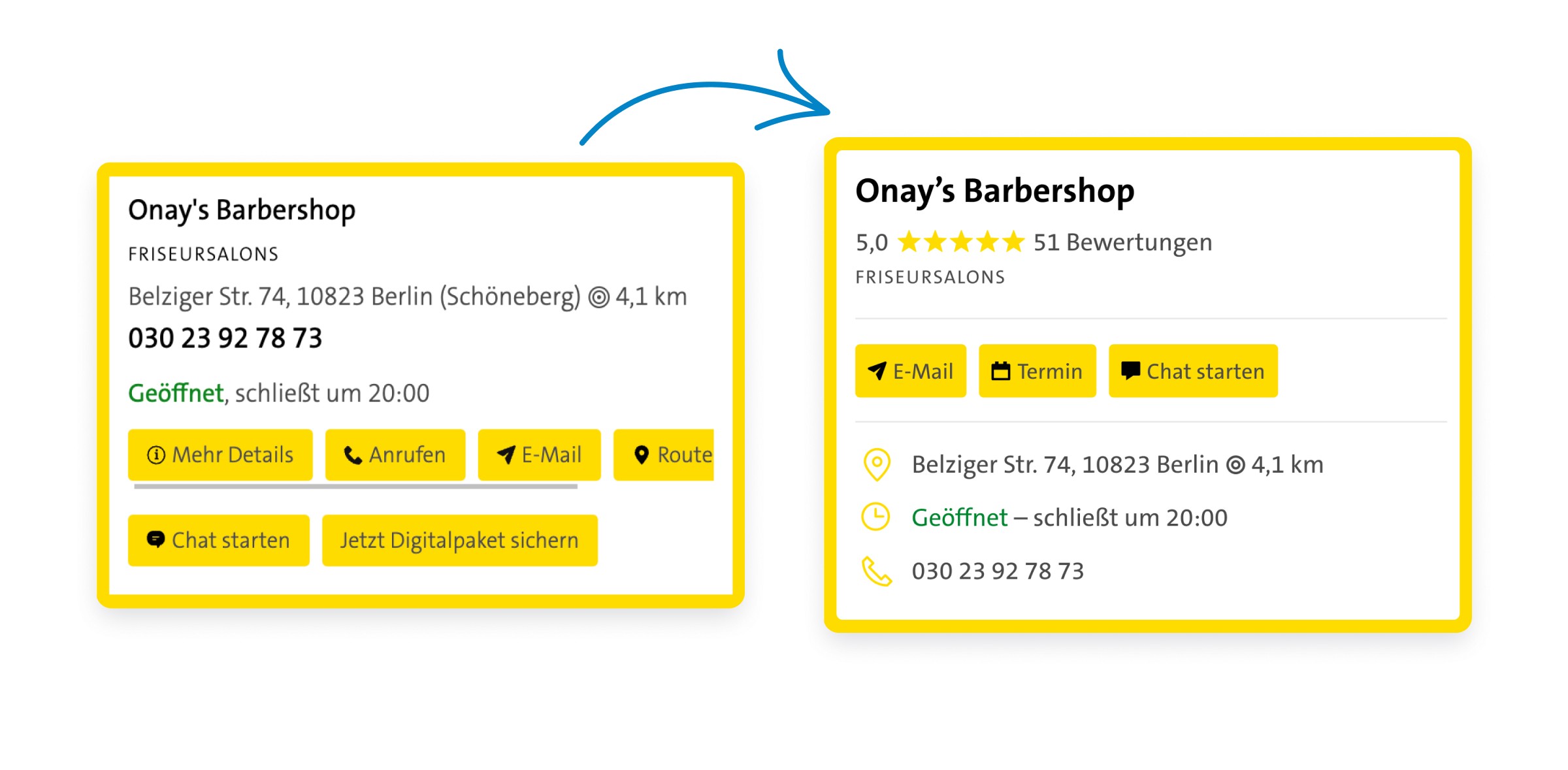
The optimized contact page for businesses features a new, modern design that provides a clearer presentation of key information such as “action buttons”, address, and opening hours. The new icons and clear layout significantly enhance the user experience.
Challenges
One of the biggest challenges was convincing internal stakeholders that it was necessary to streamline the existing product and make it more user-friendly. There was often resistance to reducing features, as these were originally considered valuable. It was crucial to persuade the stakeholders with clear user data and well-founded arguments. The success of the conducted user tests played a central role in advancing the internal decision-making process.
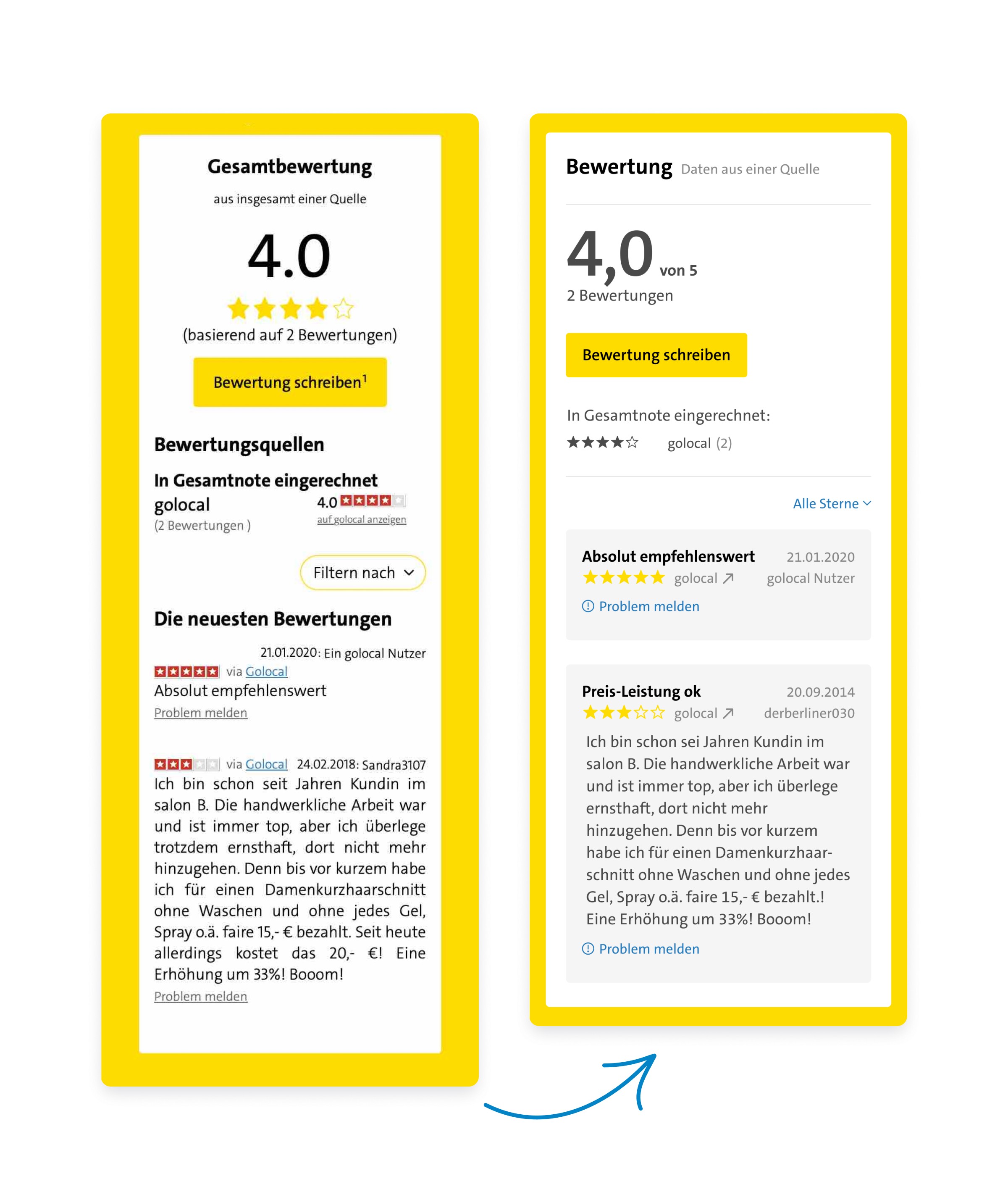
The revised review view shows a clearer and more user-friendly presentation, making it easier for users to read and filter reviews. The updated version offers intuitive handling and highlights the most important information better.
Results
The targeted measures for optimizing the product led to a significant increase in user satisfaction. The improved user experiences resulted in better market penetration among the Gelbe Seiten target audience. Users were able to navigate the platform faster and more easily, which led to longer engagement and usage.
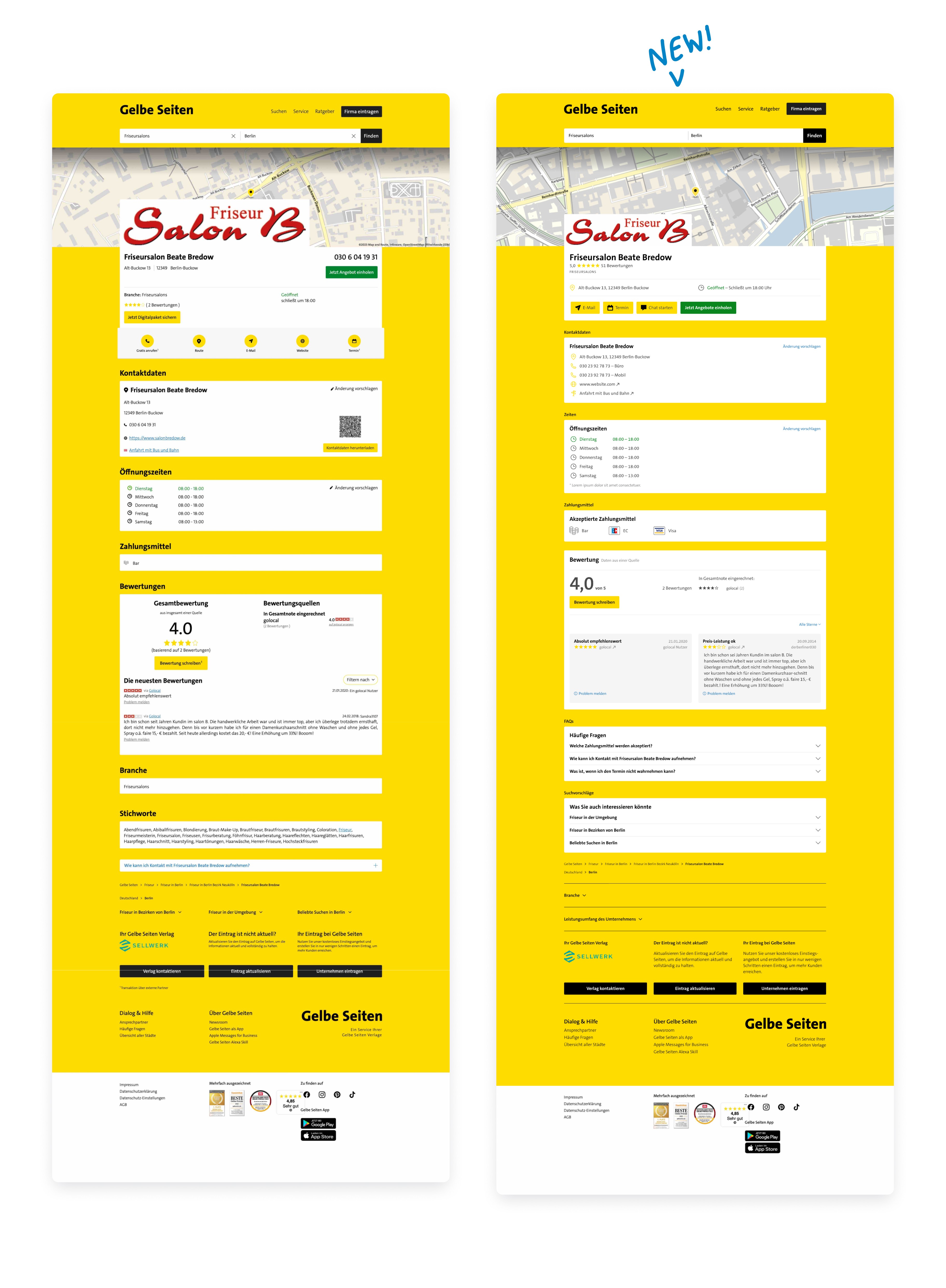
The comparison between the old and the new detail page shows how the revised version provides a cleaner and more structured presentation. Important information such as reviews and contact details are more easily accessible.
Conclusion
Through close collaboration with the Product Owner and the development team, as well as targeted user testing, we were able to sustainably improve the digital product of Gelbe Seiten. The reduction of complexity and the focus on user-friendly features significantly contributed to increasing user satisfaction and strengthened Gelbe Seiten' position in its market segment.


